Monday, April 15, 2013

Unit 9 Activity 3

"Collect four portrait images with two to five subjects.In at least one image the subject should have been placed in the foreground.Comment on the arrangement of the subjects in relation to the camera and the effectiveness of the design"

 Photo by Jessica Hilltop


Photo by Sukanto Debnath

 Photo by Brendan Stirton

Photo by Steve McCurry

Group portraits can be very diverse. Multiple subjects can be heavily focused on, or be used as sort of an accent to the main subject. An example of the latter would be the top picture; the main focus is the man in the middle. The people in the background are blurred and don't do much but create an environment for the subject. The second picture also focuses on one child more than the other, but the other child is still important. He adds a feeling of curiosity to the picture. Again, the third picture focuses on the center subject most, but the other two in the image are still important. They all set the mood, along with the background. The final image focuses on both subjects heavily. They both come together to perform a single emotion. If either subject was missing, the picture would lose meaning.

Friday, April 5, 2013

Unit 9 Activity 2

Photo by Bruce Percy

Photo by Brent Stirton

Photo by John Wright

These four images show different ways to frame a subject. The top picture uses natural objects around the subject, the trees, to frame the subject. The second picture uses a door frame to frame the monks, which also creates depth because of the location of each subject. The third image uses drapes and a traditional rug in the background. The designs on the rug creates a frame around the subject and entire picture. The fourth picture has frame created by a wide angle lens, which gives the subject very large depth from his hands to his head. 

Unit 9 Activity 1

Photo by Bruce Percy

Photo by Jessica Hilltout

Photo by Andrzej Dragan

Photo by Brent Stirton

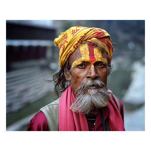
The portraits above portray four very different people. The first is a Nepalese man with bright clothing and makeup. The colors all compliment each other and make him pop. It is very beautiful and is interesting to look into such a bright and unique culture that I, personally, don't see everyday. The second is a picture of a young woman with closed eyes and messy, curly hair. She also has very defined shoulders and bones on her upper chest. She seems very natural with freckles and no makeup. The third picture of an old man has a lot of emotion in his eyes. Everything about his expression is happy and satisfied, with wonder. The fourth portrait is inspiring in the same way as the first. It shows a unique culture and style that I don't get to see in my society.

Thursday, February 14, 2013

Unit 8 Activity 4

 Tommy Ingberg

Melinda Gibson

Both images above are artistic photomontages, focusing around people and have ideas beyond realism. The top image shows a headless man flying away with a bundle of balloons replacing his head. The bottom shows the silhouette of a man laying on the floor. The silhouette is filled with a forest-like scene. It's also been made to look like the man was cut out of a previous image and replaced. The images seem to represent the dreams and imagination of humans. The bottom image could have been made to be a smooth silhouette, remove the cutout feel, but I personally like the style. The picture could also have been filled with any scenario; the forest most likely reflects the person's inner fantasies, such as a love for nature.

Wednesday, February 13, 2013

Unit 8 Activity 3


  • As editors exercise their ever-increasing power over information control, what limits would you impose on them as to the extent to which they can manipulate the photographic image? 
  • Devise a series of guidelines that will control the release of images that have been constructed for media use so that the public is aware as to the extent of the manipulation. 
There should be different guidelines for what the media and editors are trying to display. A fictional piece should be able to have zero limit to what you can manipulate. However, when the media tries to display something for sale or is passing an image off as real, there should be many guidelines. If models are modeling for weight loss, clothing, or body appearance, there should be no liquification of their frame. Acne and makeup models should not be editing to remove blemishes, and so on. If model's pictures are modified in any way, the media should notify the public, like saying so in a commercial or writing it directly on a billboard.

Tuesday, February 12, 2013

Unit 8 Activity 2

 B. Clinch
Lewis Bush

Both of these photomontages show loyalty and following of people during war. The top image is from the 1930's while the bottom image is modern. The top image could either be for or against the leadership of Stalin. It may be trying to unify the people under him, and the buildings and planes represent the technological advancement of the U.S.S.R. On the other hand, Stalin may be being portrayed as a gigantic tyrant, oppressing the blind people below him. I don't know what the word in the middle means, but it would probably explain it better. The second picture shows the cult following of nuclear weapons. These weapons are disguised as a church, showing a fake facade of the government; a welcoming outside with a hidden evil behind it.

Unit 8 Activity 1

Henry Peach Robinson's "Fading Away"

Photomontages began to be made in the late 1800's. Photographers would expose certain sections of negatives to make a single image. Many people criticized this process, most likely because it could be considered "fake" photography. Skill may not be needed to get true art if you cheat and make it up. It isn't real. Photography was about the real world, and these innovators of photomontages made photography fake. People truly couldn't believe what they saw. In my opinion, however, I think it's very unique and creative. You can use your imagination and create things unseen and create emotions that simply couldn't appear if it was a "real" photograph. In today's age, photomontages are very popular. Partially because I feel there's been a surge of new creativity, but most likely because of technology. Before Photoshop, creating a photomontage was painstaking and took hours, possibly days. Now you can do everything on a computer easily, and it often looks better too. Pictures are better quality, colors are richer, and the photos merge together more smoothly. I think there's a correlation between the technology and creativity surge as well; it may not be that the imagination is new, but all of the creative photomontages just could not be done before. With technology, we can really express ourselves much better.